THE IDEA IN ONE LINE
A volume profile maps past trades, not future orders or hidden intentions.
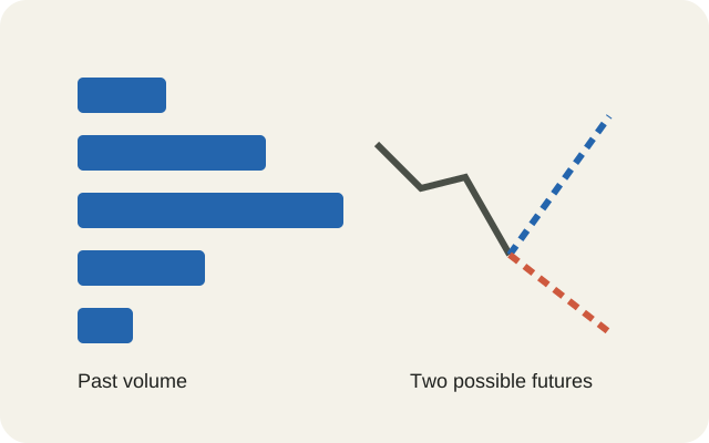
A busy price is a reference point, not a promise.
1,000invented units traded
70%selected historical volume, not a forecast
100example point of control
100–101example value-area prices
70%chosen share of past volume
95invented stop trigger
To see how much traded at each price, use a volume profile: horizontal bars that group past trading by price rather than by time. It can help mark areas to investigate as support or resistance. It cannot tell you everyone's purchase price, locate every stop-loss order, or prove that a powerful investor engineered a dip. Stops can amplify selling and execute before a rebound; prices can also keep falling. The useful distinction is between what the chart records, a plausible explanation and evidence of intent.
Past volume is neither buying pressure nor money waiting
Ordinary volume bars answer “how much traded during this minute or day?” A profile asks “how much traded around this price during my chosen interval?” Usually each row groups a price band, rather than representing every individual price. TradingView's documentation describes reconstruction from lower-timeframe bars, so apparent detail depends on the underlying data.
Every executed share has a buyer and a seller. A trade of 100 shares contributes 100 to volume, not 200. It does not establish that 100 different people bought. CME's futures example likewise counts one traded contract once.
Trading the same 100 units three times counts 300
Invented example: A sells 100 to B; B sells those 100 to C; C sells them to D.
See the data
| Transfer | Units traded | Cumulative volume |
|---|---|---|
| A to B | 100 | 100 |
| B to C | 100 | 200 |
| C to D | 100 | 300 |
This invented chain explains why volume is not the current owners' cost basis. The last holder owns 100 units, although recorded turnover is 300. A profile loses the chain of ownership: it cannot show whether earlier buyers still hold anything, or where today's holders would sell.
“Buying volume” needs a definition. A buyer who accepts a waiting seller's offer initiates a trade; a seller can instead accept a waiting buying bid. Some feeds classify that initiating side. CME's trade messages include an aggressor-side field and cases with no classified aggressor. A footprint or bid/ask display needs verified feed coverage and classification rules. It still does not identify institutions.
TradingView's conventional profile colours use lower-bar price direction to estimate up/down volume; they are not a direct count of buyer-initiated versus seller-initiated executions. Start with total volume to avoid reading an identity or motive into a colour.
The order book, also called depth of market or DOM, answers a different question: which orders are waiting now, within the feed's coverage? CME's depth documentation describes anonymous orders, and Coinbase's order guide allows open orders to be cancelled. A long historical bar therefore does not mean a large buying order waits there today.
Choose the window before interpreting the shape
In TradingView, first choose the instrument and identify its exchange or data source. Use conventional candles: synthetic chart types can distort profile calculations. Find the tool named Fixed Range Volume Profile. The official 2020 drawing-tool guide places it in the left toolbar under Prediction and Measurement Tools; current labels and placement can differ. This is a documented route, not a claim that today's interface was tested.
Click the start and end of the interval you want to inspect. Open the tool's settings, choose Total initially, and examine row size, the point-of-control line and value-area percentage. The Fixed Range documentation explains these settings and historical-data limits. More rows cannot recreate individual trades missing from the feed. Check availability in your account; no particular plan or price is assumed here.
Keep window dates, session hours and row widths consistent when comparing profiles. A Visible Range profile changes with the visible chart, so zooming or scrolling changes the sample. A Session profile separates activity by session and can distinguish regular from extended hours. These tools answer different questions even on the same asset.
Check the units as carefully as the shape. An equity feed can cover one venue rather than the whole market; TradingView documents differences in US stock feeds. Futures volume belongs to a contract and expiry. Some forex feeds show ticks, meaning updates, rather than worldwide currency traded. A crypto pair's exchange feed is not the combined market: Coinbase's feed describes its own orders and executions. Shares, contracts, updates and coins are not interchangeable measures.
Where 1,000 invented units traded
Exact hypothetical prices, highest price at the top. Blue rows form the selected value area.
See the data
| Price | Units | Share of total |
|---|---|---|
| 102 | 100 | 10% |
| 101 — VAH | 300 | 30% |
| 100 — POC / VAL | 400 | 40% |
| 99 | 150 | 15% |
| 98 | 50 | 5% |
| Total | 1,000 | 100% |
The point of control, or POC, is the largest row: 100 here, with 400 units. The value area groups a configured share of volume; 70% is a convention, not fair value or a 70% probability of a return. VAH and VAL name its highest and lowest selected prices.
For this original example, follow an adjacent-row method described by Sierra Chart: start at the POC, compare its neighbours, and add the larger. The 300 units at 101 beat the 150 at 99. Together 100 and 101 contain 700 of 1,000 units, exactly 70%; VAL is 100 and VAH is 101. Other datasets can overshoot the target when a whole row is added. These are exact invented prices, not unspecified band edges.
A high-volume node is a relative peak; a low-volume node is a valley between busier areas. This small example has one main peak, so its short tails are not labelled interior valleys. Sierra's profile documentation allows different resolutions and distinguishes developing levels from final ones. Using the day's final profile to justify a morning decision imports information that was unavailable then.
Support and resistance are hypotheses about behaviour
Support is an area below the current price where someone expects a decline to slow or reverse. Resistance is the corresponding reference above it. Prior trading can make an area worth watching, but it is not a physical wall. On returning, price can pause, bounce or cross it. If price is above a busy profile row, traders might watch it as possible support; below it, as possible resistance. Neither role follows from volume alone. A broken support can become a resistance reference without automatically changing role on the first crossing.
There is evidence for some previously identified levels, within limits. Carol Osler's 2000 study examined levels supplied by six foreign-exchange firms in 1996–1998. They anticipated intraday trend interruptions more often than arbitrary levels, with differences across firms and currencies. That is evidence about those published levels, not validation of every volume-profile rule, stock or crypto market.
A busy historical zone does not guarantee a rebound or act as an inevitable magnet; a quiet zone does not guarantee rapid passage. Price impact depends on orders available and how they change. Cont, Kukanov and Stoikov's research on 50 US stocks found a more stable short-interval relationship with order-flow imbalance at the best bid and ask than with raw traded volume. Large turnover alone does not establish direction.
A stop can trigger a cascade without revealing a plot
A conventional sell stop becomes a market order after its trigger condition. The trigger price is not a guaranteed execution price. A stop-limit instead becomes a limit order and can remain unfilled. The SEC's explanation for stock investors stresses differing broker trigger methods. Product, venue, trading hours and broker rules matter; check the actual order terms.
A gap can skip prices, including between sessions (Schwab's explanation). Nor are all stops displayed publicly: IBKR documents simulated order types held in its systems until conditions are met. The public book is not a universal map of stops.
A stop can execute before a recovery — or a further fall
Two invented continuations share the same initial decline. Dashed lines show alternatives.
See the data
| Stage | Recovery scenario | Further-fall scenario |
|---|---|---|
| Start | 100 | 100 |
| Assumed stop zone | 95 | 95 |
| After trigger | 93 | 93 |
| Possible next price | 100 | 90 |
Imagine a price falling from 100 into an assumed stop zone at 95. Triggered sales consume available buying orders; trading reaches 93. Buyers could then replenish bids and price recover to 100, or selling could continue toward 90. All these numbers are invented. FINRA warns that short declines can trigger stops before a recovery, while activated stops can add downward pressure.
If one batch of sales reaches another group of triggers, feedback can continue without a coordinator. The investor's conditional instruction executes a sale; this differs from a broker liquidating assets to meet a margin shortfall. Describing both as “being forced out” hides different mechanisms.
Osler's price-cascade study found evidence of stop-related acceleration in foreign exchange. It used orders from one large bank in 1999–2000 and minute-price analysis covering 1996–1998. Its scope does not establish how many present-day stock-market wicks involve stops, let alone manipulation. A wick records a price excursion and return, not the participants' purpose.
Separate an observed dip from proven intent
Large participants can anticipate clustered orders and trade in ways that move price through possible triggers. That does not show that every decline is a coordinated attack on retail investors. Equally, real executed trades do not make every purpose acceptable. Principle 10 of the FX Global Code explicitly rejects trading designed to move the market to a client's stop level. The Code is voluntary wholesale-FX guidance, not a universal statute for every market.
Distinguish “price dipped and recovered” from “stops could have intensified selling” and from “a named actor deliberately caused it.” The last needs evidence beyond aggregate price and volume: orders, timing, identities, communications and applicable rules. Spoofing involves intent to cancel deceptive orders before execution; a CFTC enforcement example rests on specific conduct, not the appearance of a candle. Ordinary cancellation alone does not prove it.
Before accepting a chart story, record the feed, units, window and information available at the time. Separate past executions from pending orders. Check trigger rules, possible gaps and the risk of non-execution. Write the observation and interpretation separately, then ask what evidence would contradict the interpretation. Finally consider the cash needed, time horizon and losses the position can bear. Widening or removing stops cannot eliminate risk, and buying after a wick does not guarantee a rebound.
A useful chart makes uncertainty easier to examine. Keep the competing explanation beside the attractive one: a temporary dip and a lasting repricing can begin with the same downward line. The profile supplies a historical reference; it cannot choose your risk budget or certify the next move.
Sources and method
- TradingView: volume profile concepts and calculation
- CME: what is volume?
- TradingView: Fixed Range drawing tool guide (2020)
- TradingView: Fixed Range Volume Profile settings and data
- TradingView: Visible Range Volume Profile
- TradingView: Session Volume Profile
- TradingView: US stock feed coverage
- Coinbase: Exchange market-data feeds
- CME: trade summary and aggressor side
- Sierra Chart: point of control and value area calculations
- Sierra Chart: Volume by Price and developing levels
- CME: Market by Order and anonymous depth
- Coinbase: order management and cancellation
- Carol Osler: support and resistance in foreign exchange (2000)
- Cont, Kukanov and Stoikov: The Price Impact of Order Book Events
- SEC Investor.gov: stop, stop-limit and trailing stop orders
- Schwab: stop orders and price gaps
- FINRA: Regulatory Notice 16-19
- IBKR: order types, simulated stops and trigger methods
- Carol Osler: Stop-Loss Orders and Price Cascades (Staff Report 150)
- FX Global Code, December 2024, Principle 10
- Global FX Committee: scope and voluntary nature of the Code
- CFTC: enforcement example involving intent to cancel orders (2026)
Sources checked 15 October 2026. Original hypothetical diagrams and arithmetic only; no observed institutional order flow, stop map, historical trading case or predictive backtest. Platform steps are documentation-based and availability was not tested in an account.